Reporting SEO to Non-SEO Stakeholders Without Lying
Translate rankings into the numbers your CFO, CMO, and board actually care about
A CFO does not care that you ranked #4 for "enterprise CRM software." A CFO cares whether the money you spent on content this quarter produced more pipeline than it cost. The gap between what SEO teams measure and what executives need to decide on is the single largest source of distrust between SEO and the rest of the business.
The temptation, when reporting up, is to glue together numbers that look impressive. Impressions doubled. Average position improved by 4 spots. Click-through rate is up 12%. Each of those statements may be true and useless. They survive in reports because they are easy to pull, easy to format, and rarely challenged. They die the first time an executive asks "so what does that mean for revenue?"
This article is the working playbook for translating SEO performance into language that holds up under audit. Templates by audience, the metrics that translate cleanly, the metrics that should never appear in an executive report, and the screenshot trap that has cost more than one in-house SEO their job.
The translation problem in one sentence
Every SEO metric exists somewhere on a chain: query coverage → rankings → impressions → clicks → sessions → engaged sessions → conversions → revenue. The further left, the more SEO-specific. The further right, the more executive-relevant. Your job in any report is to walk the metric as far right as the data honestly allows, then stop before you fabricate the last step.
The honest stop point depends on your tracking. If you have clean conversion tracking from organic to a revenue event, you can report attributed revenue. If you only have conversion tracking to a lead form, you stop at conversions and let sales-cycle data fill the gap. If you have neither, you stop at sessions and acknowledge the limit out loud. The mistake is taking a left-side metric and pretending it speaks for the right side.
This is also where most SEO reports lose credibility. A chart of impressions climbing 40% over a quarter, presented to a board, implies revenue is climbing 40%. It almost never is. When the next board meeting reveals revenue flat, the SEO report is the first thing to lose trust.
What every audience actually wants
Before picking metrics, ask what decision the audience is trying to make. The decision drives the metrics, not the other way around.
The CFO is deciding whether SEO investment should grow, hold, or shrink next quarter. They need a number that compares to alternative uses of the same dollar. Cost-per-organic-session, cost-per-conversion, and where possible, attributed revenue versus content cost.
The CMO is deciding how SEO fits the broader marketing mix. They need to see SEO's contribution alongside paid, social, and email — same time period, same conversion definition, same attribution model. They also want to know which content categories are working and which are not, because that influences editorial priorities.
The founder, especially in early-stage companies, is deciding whether the SEO bet is paying off and whether to keep funding it. They want directional certainty more than precision. Is organic growing? Is it scalable? What's the leading indicator that says yes or no in the next 90 days?
The board is deciding whether the company's growth narrative is intact. They are not auditing the SEO function — they are stress-testing the GTM thesis. SEO appears in their report only as a contributor to a top-line number, with one or two qualitative notes about the moat (defensibility) it builds.
Each audience gets a different chart, even when the underlying data is the same. The CFO gets dollars. The CMO gets channel comparison. The founder gets trend lines. The board gets two bullets and a percentage of revenue.
The CFO template
A CFO report has three numbers and a footnote. The numbers are this quarter's organic-attributed revenue, the cost of producing it (content, tools, headcount allocation), and the implied return. The footnote explains the attribution model and any data gaps.
Attributed revenue is the single hardest number to produce honestly. If your business is e-commerce with last-non-direct attribution and clean GA4 conversion tracking, the number falls out of a report. If your business is B2B SaaS with a 90-day sales cycle, multi-touch attribution, and a CRM that tracks lead source but not assisted touches, the number requires a documented methodology — and that methodology should be on the same page as the number.
Cost is easier but rarely fully accounted. Include the obvious — content production, SEO tools, agency or freelancer fees — and the less obvious — engineering hours spent on technical fixes, the fully-loaded cost of in-house headcount, and any portion of platform fees attributable to SEO. Most internal SEO reports under-count cost by 30-50% because engineering time disappears into the general dev budget. Don't undercount. The CFO will spot it eventually.
The implied return is revenue divided by cost. Express it as a multiple (3.2x) or as a payback period (4.1 months), not as a percentage — percentages confuse people when the input is a multi-month investment with delayed return. See calculating ROI for SEO for the three models you can use here, and which one survives audit.
The footnote is non-negotiable. Two sentences, no more. "Attribution uses GA4 last-non-direct on a 30-day window. Sales-cycle conversions before close are attributed at the lead-creation event, not the closed-won event." Without this, the CFO has no way to interpret the number.
The CMO template
A CMO needs SEO in context, which means a multi-channel comparison table and a content-category breakdown.
The comparison table has every acquisition channel as a row and the same three columns: sessions, conversions, conversion rate. Rank the rows by conversions. SEO usually ranks first or second on session volume and somewhere in the middle on conversion rate — that's the honest picture. Don't doctor the comparison by excluding direct traffic or by changing conversion definition mid-table.
The content-category breakdown shows which clusters of your content drive the conversion volume. Group by topic cluster (matching your pillar/satellite structure), and report sessions, engagement rate, and conversions for each cluster over the period. The CMO is looking for two things: which clusters justify continued investment, and which underperform and need either pruning or refresh. See cohort analysis for SEO for the deeper version of this same lens.
The trap to avoid here is the "top pages" list — the 20 highest-traffic pages on the site. Executives love the format because it feels concrete, but it is almost always misleading. The top pages are the top because they have been ranking longest, not because they are the most strategically valuable. Use category roll-ups instead of page lists.
One useful supplementary chart for a CMO: brand versus non-brand organic split. If 80% of your organic traffic is searches that include your brand name, your SEO function is largely capturing demand the rest of marketing created. If 80% is non-brand, SEO is creating demand. Most businesses are somewhere in the middle, and the trend over time is the interesting story.
The founder template
A founder report fits on one slide. It shows the trend lines for organic sessions, organic conversions (or the closest leading indicator), and the conversion rate. Three lines, six months of data, with a callout for any anomaly larger than 15%.
Above the chart, a single sentence in plain language: "Organic is growing, conversion rate is stable, and the next bottleneck is content production capacity." Or: "Organic is plateauing because we've saturated our top-of-funnel keywords, and the next bet is bottom-funnel content for sales enablement." Or: "Organic conversions are down because we deindexed 200 thin pages in March, and the recovery curve is on track."
The narrative is the deliverable. The chart is the evidence. Founders read the narrative first and the chart second; if the narrative is honest and the chart agrees, you've done the report right.
What kills founder trust faster than anything is a report that says "growth is on track" while the chart shows a flat line. If the line is flat, the narrative is "growth has stalled and here's what we're testing." Honesty here builds equity that pays off the next quarter when you need to defend a slow recovery.
The board template
A board sees SEO once a quarter, in a 30-second mention inside a longer growth update. Two numbers and one qualitative line.
The two numbers are organic's percentage of total revenue (or pipeline, depending on your business model) and the year-over-year change in that percentage. "Organic accounted for 38% of pipeline this quarter, up from 32% a year ago" is a complete board update on SEO. Anything more is wasted board time.
The qualitative line is a one-sentence narrative about defensibility. "Our top 50 commercial pages have grown a backlink moat that's hard to replicate in under 18 months." Or: "We're tracking AI Overviews citations as a leading indicator of where Google is headed." This line exists because boards care about competitive position, not channel mechanics.
Do not put GSC screenshots in board decks. Do not put ranking tables. Do not put keyword lists. The instinct to "show the work" by including granular data is wrong for a board audience — it signals you don't know what's important.
What to never include
A short list of metrics that should not appear in any report going to a non-SEO audience.
Average position. GSC's average position is averaged across personalization, location, device, and AI Overviews flicker. It moves around for reasons that have nothing to do with your work. An executive sees "average position dropped from 8.2 to 9.1" and panics. The drop usually means nothing. Read GSC vs rank trackers for the deeper context on why this metric is unsafe outside an SEO team.
Total keyword count. "We rank for 12,400 keywords" sounds impressive and means very little. Most of those keywords get one impression a month at position 78. The number rises and falls with how aggressively your rank tracker is tracking, not with anything you did.
Bounce rate. Bounce rate stopped existing as a default metric when GA4 launched. The replacement is engagement rate, and the two are not direct opposites. Reporting bounce rate to a non-technical audience invites confusion about what the number actually measures. See engagement rate vs bounce rate for what changed and how to talk about it.
Time on page (without engaged-session context). Raw time on page in GA4 is a noisy signal — sessions that engage briefly and then close the tab can show high "time on page" because the timing is bound by the next event, not by attention. Use engaged sessions or scroll-depth events instead.
SERP feature counts. "We won 12 featured snippets this quarter" sounds like a result. It is a leading indicator at best, and only if those snippets are on commercially valuable queries. The right metric is the click and conversion impact of the snippets, not the snippet count itself.
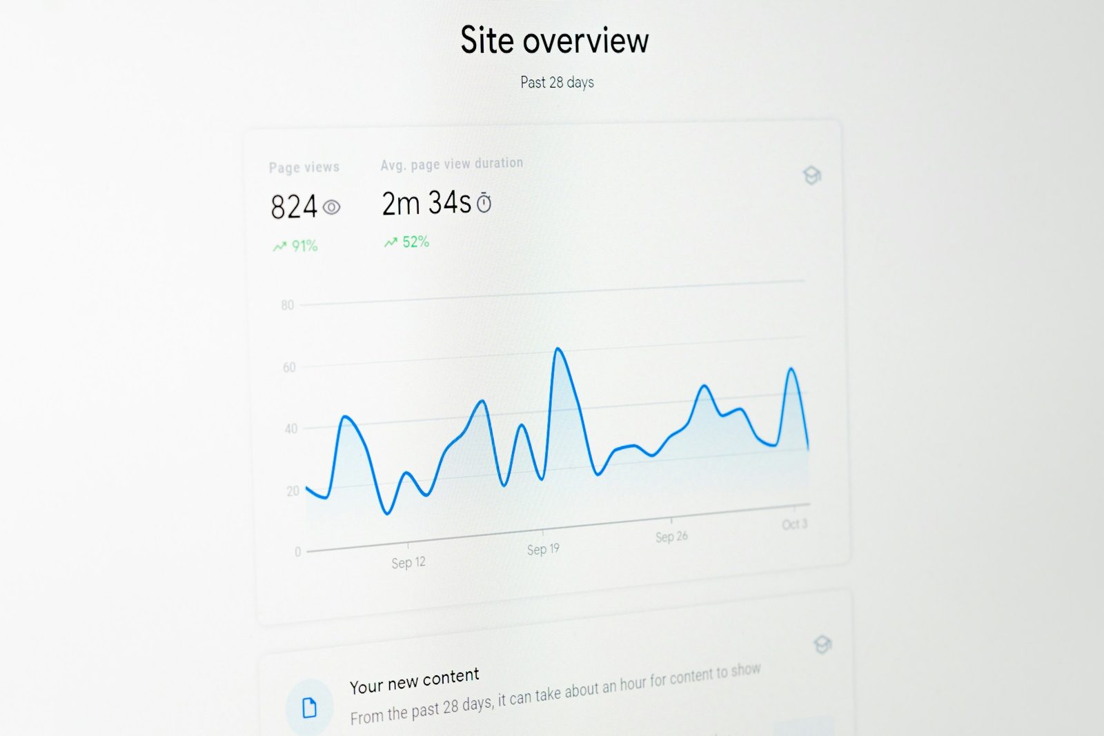
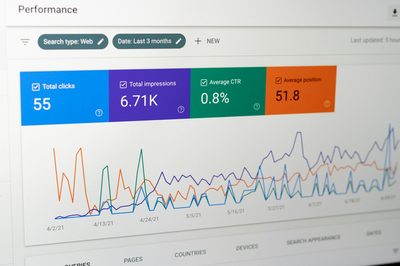
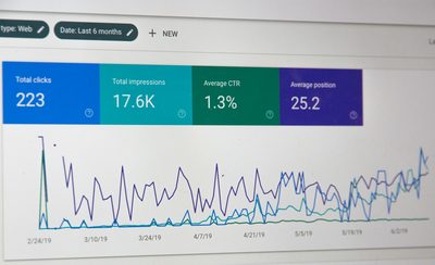
The GSC dashboard screenshot trap
The most common executive-reporting mistake in the audit logs: the SEO lead screenshots the GSC Performance dashboard, pastes it into a slide, and presents it to the leadership team. The chart shows clicks and impressions over 16 months. The line is going up. Everyone nods. Meeting moves on.
What's wrong with this? Several things, depending on the week.
GSC defaults to last-90-days unless you change it. So the line that "shows 16 months going up" actually shows 90 days, and the trend looks dramatic because the y-axis auto-scales to the visible data. Change the date range and the same data looks flat.
GSC counts AI Overviews appearances as impressions in some cases and not in others, and the methodology has changed twice in the last 18 months. An impression climb of 30% might reflect actual coverage growth or might reflect a counting-methodology update from Google.
GSC anonymizes queries below a threshold. The numbers in the dashboard exclude long-tail searches that fall below the privacy floor. The dashboard understates total search activity and the gap is invisible.
Worst, the GSC screenshot rarely matches your GA4 numbers. GSC counts clicks; GA4 counts sessions; the two diverge by 10-30% routinely due to redirects, rapid back-button behavior, and cross-device session unification in GA4. An executive who sees one number in the SEO report and a different number in the marketing report concludes that the data is unreliable.
The fix is to never report from a screenshot. Pull the data, transform it, present it in your own chart with a clear methodology note. The work is more, but the credibility you keep is worth it.
Frequency and rhythm
Different audiences want different update cadences.
The CFO wants a monthly snapshot, with a quarterly deep-dive that aligns to the financial close. The cadence matches the rhythm of their decision-making.
The CMO wants weekly trend awareness during launches and monthly otherwise. SEO is one input to a broader marketing decision pace.
The founder wants whatever they ask for, when they ask for it. The structural answer is a self-serve dashboard they can hit anytime, with a monthly written narrative that pre-empts the questions they would otherwise ask.
The board sees SEO quarterly. Do not report more often than that to a board. Doing so signals you don't trust your own numbers to be stable.
Putting this into your reporting cadence
Start by building four templates — one per audience — and committing to them in writing. The templates encode the metrics, the methodology, and the boundaries. They make the reporting work mechanical instead of judgment-based, which means you stop quietly picking flattering numbers because you ran out of time.
Pre-write the methodology footnotes once and copy them every report. They will save you from the version of this conversation where a CFO asks "what does attributed revenue mean exactly" and you don't have a one-sentence answer ready.
Audit your last four quarters of reports against the templates. Where did you include something on the "never include" list? Where did the narrative outrun the data? Where did a screenshot replace work? Each instance is a credibility leak you can patch.
The reporting layer is the bridge between SEO work and continued investment in SEO. The work can be excellent and the reports can sink it. The work can be average and the reports can extend the runway long enough to do better work. The plumbing matters.
For the broader picture this fits into, see the SEO analytics stack pillar, which describes the data sources, attribution model, and KPI tree that feed the templates above. If you want the deepest lens on what numbers your reports rest on, share-of-voice tracking is the one metric that gives a CMO real strategic context across competitors — and it's the one most reports skip.
The goal is not to make SEO sound good. The goal is to make SEO legible. Legible numbers that hold up under stress get funded. Impressive numbers that don't hold up get cut the first quarter the business needs to make a hard call.
Related articles
Attribution Models for SEO: Pick the One That Doesn't Lie
Last-click hides the work SEO does. First-click hides the work everyone else does. Here's how to pick an attribution model that survives a real audit.
Cohort Analysis for SEO: Beyond Vanity Trends
Site-wide traffic charts hide the real story. Group landing pages by acquisition month and you'll see which content compounds, which decays, and where to refresh — with concrete spreadsheet steps.

The SEO Analytics Stack: GSC, GA4, and What Else Matters
GA4 confused everybody. GSC stayed honest. Third-party tools fill specific gaps. Here is the full SEO measurement stack — data sources, attribution, KPI tree, dashboards — without the vendor pitch.